Ici archive

I originally wrote this article to be published on Dataiku’s blog here.

Data Science, From Enthusiastic Commitment to Frustrating Results

A growing interest in data science and artificial intelligence (AI) has been observed over the past decade, both in professional and private spheres. A variety of uses have appeared, such as selecting sitcom scenarios to gain viewers, writing articles for the press automatically, developing stronger-than-human AI for particularly difficult games, or creating smart chatbots to assist customers. Furthermore, numerous influential actors in the technology space demonstrate strong enthusiasm towards AI:

  • AI is going to be the next big shift in technology.
    Satya Nadella, Microsoft CEO
  • It is a renaissance, it is a golden age.
    Jeff Bezos, Amazon CEO
  • AI […] is more profound than […] fire or electricity.
    Sundar Pichai, Google CEO

Beyond these promises, there are significant investments being made in data science and AI. Both retrospective and prospective figures are massive: the market was worth $20.7 billion in 2018 and the compound growth is expected to reach 33% by 2026, according to this study. The report “Data and Innovation: Leveraging Big Data and AI to Accelerate Business Transformation” by NewVantage Partners in 2019 showed that the majority of the 65 companies investigated react proactively and positively to data science and AI (see Figure 1 below, left panel).

Furthermore, numerous countries are investing significant resources to develop AI initiatives: the Digital Europe funding program dedicated 2.5 billion euros to AI research, the DARPA funding campaign raised two billion dollars to fund the next wave of AI technologies, and China declared its goal to lead the world in AI by 2030. Altogether, these observations argue that most stakeholders are aware of the importance of data science and AI, and commit to its development in their activities.

Despite these dynamic trends of investment and constructive attitudes from companies, there are also some alarming — sometimes even shocking — observations regarding the deployment of data science and AI. Indeed, the rate of data science projects which do not succeed may be as high as 85% or 87%. This low performance does not only affect young companies — it can also be observed within data-mature businesses.

The study “Artificial Intelligence Global Adoption Trends & Strategies” conducted by the IDC in 2019 among 2,473 organizations exploiting AI in their operations reported that one-fourth of them have a failure rate of AI projects higher than 50%, while another one-fourth of them consider having developed an AI strategy at scale.

The report of NewVantage Partners mentioned above has also studied the nature of the obstacles met by companies while deploying data science and AI programs: the main limitations appear to be cultural rather than technological (see Figure 1 above, right panel). In this sense, this study reports that 77.1% of consulted companies have identified AI adoption by business experts as a major challenge.

To sum up, many have high expectations for data science and AI, given the media coverage and the level of investment. However, in practice, its performance is low and restrained by cultural obstacles. This contradictory gap between expectations and the “reality” is not rare in the technology sector, and can lead to a “trough of disillusionment” as described by Gartner in “hype cycles” (see Figure 2 above, panel A). In fact, AI has already fluctuated between such highs and lows three times. In the history of AI, hype periods of intense investment and development were followed by an “AI winter”, with no activity in the field (see Figure 2 above, panel B).

Then, the next question we should ask ourselves is: are we about to live a fourth “AI winter” with a “data science bubble burst”, or will the field continue to flourish? The answer will depend on us, and we firmly believe that adoption will be a key ingredient in the success or the failure of AI in the coming decade. This article describes the different cultural obstacles to successful data science and AI, and, in light of this analysis, presents a systemic and organizational lever to address these obstacles and foster adoption at scale: a new position named the “Data Adoption Officer.”

The Cultural Pains of Data Science

In the following sections, we will look at a variety of cultural obstacles met during the deployment at scale of data science and AI. To simplify the complex landscape, the limitations listed below are grouped along four main dimensions: the data scientists, the resources, the hermeticism of data science and AI, and MLOps.

Pain 1 – Data Scientist, The Sexiest Trickiest Job of the 21st Century

While the data scientist has been advertised as the sexiest job of the 21st century by an article in the Harvard Business Review, it may also be one of the trickiest positions for many reasons described below, including skill shortages, heterogenous profiles, an ill-defined job description, and significant turnover.

Skill Shortages

In their study Artificial Intelligence Global Adoption Trends & Strategies, the IDC reports that skill shortages are identified by companies as a major cause of AI project failure. Although numerous graduate programs in data science and AI have appeared in the last few years, the need for skillful data scientists is not fulfilled. In August 2018, LinkedIn stated that there was a shortage of 151,000 data scientists in the U.S.

Aside from this quantitative shortage, there is also a qualitative one. Since the data science discipline is fairly young, most senior data scientists come from other fields. Thus, while there are more and more juniors arriving on the labor market, companies struggle to find experienced profiles to drive a dynamic vision and strategy and enable skill transfer.

Heterogeneous Profiles

One of the consequences of having many reconverted data scientists on the labor market is the strong heterogeneity of profiles, both in terms of educational background (see Figure 3 below, panel A) and previous experience (see Figure 3 below, panel B). Every field has its own culture, made of distinct methodologies and knowledge bases. Similarly, the other job titles have their own roadmap, scope and goals.

Furthermore, a Kaggle poll showed that 66% of the participants learned data science on their own (likely overestimated due to selection bias), which contributes to the diverse nature of this discipline. Without a doubt, this diversity may generate interesting synergies and values. However, it also slows down the composition and acquisition of a common frame of reference. The data science community has a vital need of social cohesion to consolidate its unity.

Data Scientist, an Ill-Defined Position

Data scientists are expected to have numerous talents, from hard sciences to soft skills through business expertise. Altogether, the ideal data scientist endowed with all these abilities rather looks like a “five-legged sheep” (see Figure 4 below). Such a mix of objectives, roles, and functions makes it difficult for data scientists to handle all these aspects at once. And if data scientists are five-legged sheep, then a lead data scientist and a Chief Data Officer (CDO) may perhaps be a chimera. Indeed, NewVantage Partners reported in their 2019 study “Data and Innovation: Leveraging Big Data and AI to Accelerate Business Transformation” that the CDO’s role is changing gradually and is not well described, leaving the CDO rather helpless.

Significant Turnover

According to a study published in the Training Industry Quarterly, an employee needs one to two years to be fully productive when starting a new job. Given the numerous challenges that data scientists face in their duties, as presented earlier, this may rather be two years. In 2015, a global poll realized by KDNuggets among data scientists revealed that half of the participants stayed at their previous role for less than 18 months. Such a turnover in data teams is a productivity killer. However, the participants stated that they were willing to stay longer in their current position.

Since KDNuggets’ survey, however, it seems that the length of a data scientist position has increased: the average tenure at a previous data science job is 2.6 years for data scientists who took part in a survey conducted by Burtch Works and who changed jobs in 2018 (representing 17.6% of the participants). Even if there is a clear improvement since 2015, the average tenure for a data scientist seems still neatly below those of other jobs in the US (4.6 years according to the Bureau of Labor Statistics). Below is a non-exhaustive list of some reasons that data scientists change jobs:

  • Mismatch between expectation and reality
  • Company politics
  • Overloaded by data duties, which most of the time are not machine learning-related
  • Working in isolation
  • Lack of macroscopic vision concerning the roadmap
  • Infrastructure and/or data not sufficiently mature (cold start in ML)

Losing an asset on which a company has invested negatively impacts a data team’s activity. Thus, retaining data scientists should be a major concern for companies. To help retain talent, companies may want to consider Happiness Management, which is closely related to adoption and the points listed above, since:

“One is not happy because one succeeds, one succeeds because one is happy.”

Pain 2 — Suboptimal Usage of Resources

Resources have different origins, and can be split into three types: tools, data and humans. All of these resources suffer from suboptimal usages as described below.

A Multiplicity of Tools Penalizing Quality

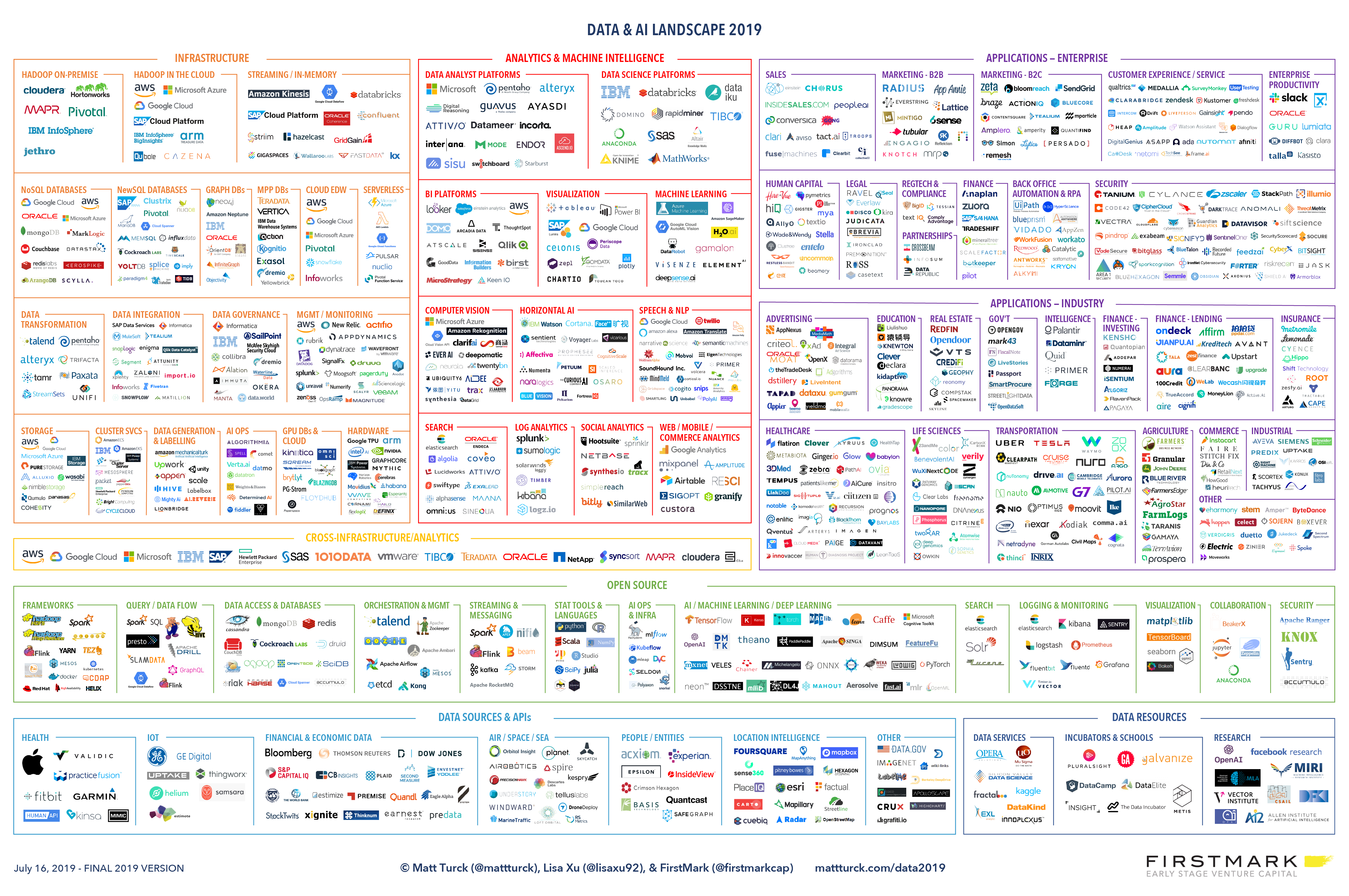
The data lifecycle is not a long, quiet river and is, rather, composed of numerous stages. Each of them can be categorized into different perimeters, either functionally, technologically, or thematically. And for each perimeter of each stage, numerous solutions exist. Therefore, the data and AI landscape in 2019 in terms of tools was fairly crowded (see Figure 5 below).

This multiplicity of tools obliges data teams to include in their pipeline a diversity of technologies, each of them having their own complex functioning. It requires a great discipline and expertise to consolidate the best practices across space and time for each technology to reach a utopian “generalized best practices.” The reality is often far from this, inducing decreased performance and even hazards.

The Data Management Bottleneck

Greg Hanson from Informatica has a great (overstated) sentence which summarizes the following paragraph:

“The hardest part of AI and analytics is not AI, it is data management.”

As a matter of fact, data science and AI do not escape the GIGO constraint: Garbage In, Garbage Out. In other words, the quality of the information coming out cannot be better than the quality of information that went in. The inputs that AI models receive come from a long sequence of actions (see Figure 6 below, panel A), with possible alterations of quality at each step, justifying Greg Hanson’s slogan.

Data quality is precisely a great matter of concerns among data scientists. In the Kaggle survey from 2017 named “The State of Data Science & Machine Learning,” three of the top five obstacles encountered by data scientists are related to data management (see Figure 6 below, panel B). Finally, data management can sometimes be overflowed by short-term compelling duties, blocking any attempt to develop a long-term vision/program to widen the data horizon. Since most of the work of a data scientist depends greatly on efficient data management, its inertia can be an import limitation.

Blindfold Human Resources

Knowing quantitatively what oneself knows is not easy and requires rare metacognitive skills. Therefore, knowing what a team knows, through its individuals and as a group is even more difficult. This is particularly true for data science, which involves a vast knowledge grounded in many fields (statistics, computer science, mathematics, machine learning, etc.) and completed by the need of a business expertise. Skills management may greatly benefit the data science activity of an entity.

Besides, it is echoing the observations of section A with regards to happiness management, since it may facilitate and optimize the upskilling track of each data scientist. It may also stimulate the R&D activities by identifying blind spots to investigate, improve recruitment by matching candidates with existing assets, and identify the priority needs in terms of external services providers (consulting, expertise, etc.).

Pain 3 — A Hermetic Field Preventing Global Adoption

Since data science and AI are complex subjects, there is a risk of rejection by the population and business experts. This hermetic field may either generate fears or a disinterested posture. Sometimes, it is the structure of companies made of silos which slow down collaboration possibilities. Because of this, it is important that the data community tries to include everyone in its activity, to prevent any inequalities enhancement. These ideas are discussed below.

Fear of the Unknown

Change can be frightening, a fortiori when it is not intelligible. Because AI is complex, and sometimes suffers from a black-box effect, the related new technologies generate fear as observed in a survey ordered by Saegus, in which 60% of the participants reported such worries. Beyond the “unknown” factor, many other characteristics may create anxiety in the population. For instance, people dread robots which may replace them at work, similarly to the mechanization of agriculture (50% of the working force was working in agriculture in 1870, when it is 2% nowadays). This is not just a delusion: 47% of jobs may potentially be replaced (or augmented) by AI in the U.S. according to this report.

Another source of fear is related to possible dysfunctional AI, as advertised by numerous bad buzz: an autonomous vehicle that kills a pedestrian in Arizona in 2018, the inability of almost all the models to predict the victory of France at the soccer World Cup in 2018, some smart speakers which get activated loudly in the middle of the night, etc. In addition, when AI models are not dysfunctional, they might just escape our control: biased algorithms favoring male candidates in Amazon’s recruitment process, two chatbots collaborating to trade goods which build their own non-human language, or Microsoft’s chatbot Tay which published violent content on Twitter.

If the models survive also these downsides, another risk is the misuse of these technologies: autonomous weapons such as the Google’s Maven project, social manipulation during elections, mass surveillance and privacy violation, etc. Some of these concerns are legitimate, and many scientists have shared them, such as when Stephen Hawking said:

Success in creating effective AI could be the biggest event in the history of our civilization. Or the worst.

There is still a lot of progress to be made to protect users and people from these risks since there is a legal vacuum on most of the related topics (see Figure 7 below). It is a duty of the data community to take part in the legal framing of AI. The corresponding protection may facilitate the global adoption of AI.

The Clash of Cultures

It is essential that data teams and business experts collaborate fluidly, which is currently not always the case. A survey by Spiceworks showed that seven in ten IT professionals considered collaboration as a major priority. In the worst-case scenario, data scientists miss the ability to take advice from business experts while the former does not take into consideration data-driven elements provided by the latter to take a decision (see Figure 8 below, Panel A).

Most of the time, there is some good will from both sides, but the difficulties to collaborate can still emerge from existing silos in the company which is often the case. Statistics and consequences are presented in the panel B of Figure 8 below: silos are often harmful for developing at scale AI solution. Breaking these silos is the main solution to this constraint.

Data Science and Inequalities

Digital inequalities tend to replicate social inequality in terms of socio-economic status (education, gender, age, place of residence, professional situation, etc.). For instance, in France, the Insee reports in a study that:

  • 15% of the active population has had no connection to internet in a year.
  • 38% of users lack at least one digital skill (search, communication, software manipulation, problem solving).
  • 25% of the population does not know how to get information online.

With such skills gaps on digital basics, the risk that AI will strengthen inequalities is real. Having two “parallel worlds”, with data-aware people on one side, and the others on the other one, can only be detrimental to data science. AI inequalities would be particularly strong on the following dimensions:

  • Level of education
  • Access to work
  • Access to information
  • Access to technologies
  • Biased AI favoring a ruling minority

In business, such inequality may appear with regards to transgenerational issues, as young people become more fluent in these technologies. Generally speaking, it is critical to advocate for an inclusive data science, serving everyone, with no one left behind.

Pain 4 — The Long Path Full of Risks Towards Value Generation Along Project’s Lifecycle

The integration of the DevOps culture into data science and AI projects definitely deserves to be briefly mentioned here, but the gigantic technical aspect of MLOps will not be explicitly covered. Below, only general and cultural factors constraining data science from blooming and associated with MLOps are presented: the peculiarities of machine learning which render DevOps adaptation to AI not that simple, the youthfulness of the MLOps tools, and the difficult cohabitation of agile methodologies and data science.

Machine Learning and DevOps

As mentioned previously, an AI project is a succession of numerous stages, from ideation to industrialization through POC. It is beneficial to manage systematically and automatically projects throughout its entire lifecycle, and in this line of idea, DevOps may be inspiring. However, the specificities of machine learning complicate the application of DevOps principles in an AI project. The peculiarities of ML with regards to DevOps are presented in the table below (see Figure 9 below).

MLOps Tools on Track of Development Paths

Because of the AI and ML specificities presented in the previous paragraph, dedicated methodologies and tools are needed, called MLOps. This discipline is even younger than data science. As a consequence, the existing MLOps tools — even if really promising — are still on track of development paths. For instance, corresponding tools may be notable: ModelDB, Kubeflow, MLflow, Pachyderm, DVC.

Because of their youthfulness, they would benefit from longer-term testing. From a general point of view, most of these tools were the results of local initiatives (sometimes redundant). Up until now, no methodological standards have been agreed upon in the community. One effect is that there is often a lack of interoperability between these technologies.

Agile Methodology and “Clumsy” Data Science

Agile methodologies are essential in many cases to facilitate collaboration, to converge to a solution satisfying everybody, while improving the productivity of the team. They are particularly used in the IT sector. However, some data scientists consider their work as incompatible with the methods. Indeed, in addition to the specificities of AI and ML presented previously, it is often really difficult to estimate the duration of some tasks — such as data wrangling — and consequently may inactivate the concept of sprint.

Furthermore, some intermediate results that cannot be anticipated may be central to a Go/No-Go decision which may abruptly interrupt a project. Whatever the reasons leading to a non-agile methodology (if any) within a data team, beyond a possible suboptimal way of working, it may impact negatively any attempts to collaborate with other departments.

Conclusion

To sum up, while significant investments are made to develop data science and AI in most business sectors, the rate of successful AI projects is unacceptable. The difficulties met by companies to deploy AI at scale are mainly cultural and can be described along four dimensions.

The first dimension is related to the data scientist population, which is not easy to handle: skill shortages on the labor market, heterogeneous profiles, overly ambitious job descriptions, and high turnover. The second dimension is associated with the suboptimal usage of resources, including tools, data and talent.

The third dimension corresponds to the siloed nature of data science and AI, which generates fears, cultural clashes and inequality, stifling collective data adoption. Finally, the fourth dimension is represented by MLOps issues: the specificities of AI that complicate the application of DevOps principles, young dedicated tools that are still in development, and, sometimes, a lack of agility in AI projects.

This diagnostic is absolutely necessary to anticipate any actions to overcome cultural obstacles. One may employ a specific and stand-alone solution for each obstacle, but this may not be the most efficient approach — low accountability, unbalanced agenda, lack of coordination, etc. This is why at Saegus, we have developed a holistic solution: an ingrained and organizational lever addressing every obstacle and fostering adoption at scale. This is a new job named the “Data Adoption Officer”. Our motto concerning data adoption is:

“Technological evolution must be complemented by cultural progress. Adoption is a major issue, so for individual and collective fulfillment and deployment at scale teams need an efficient, fruitful, inclusive, and humanistic data science practice.”

Contact our experts to make a diagnosis and find solutions fitted to your needs.

Rédigé par Clément Moutard, Consultant Data Driven Business

Notes
[1] Where Do Data Scientists Come From ?

During these challenging times, almost all companies had to completely change their work environment. COVID-19 has turned a lot of teams into remote teams and that can become a lonely experience for employees who are used to being around their co-workers.

At Saegus, digital transformation, collaborative tools and doing things remotely is part of our work. Although, with the spread of the health crisis, we had to adapt even more. That’s why we have challenged ourselves to stay innovative and bring new ideas upfront. Our goal? Keep what matters most to us: human connection. Since the beginning of the lockdown, every Thursday at 6pm, our team has been doing team building activities. We had monthly team buildings before, we just had to adapt them to the situation in both frequency and remoteness.

How do we keep closeness that makes a team great? How can team members connect and keep up with what is going on with the distance? How do you keep team building activities fun and not repetitive? These are all questions we asked ourselves as a team. We also wanted for everybody to get involved in the creation of these activities and to keep the team united.

We have put together a list of 5 remote team-building ideas which we have tested, and that we would like to share. These ideas have been tried, tested and adopted in a remote environment, but could easily be tried physically.

Every week a team of two co-workers (different duo every week) are designated to organize and lead the challenge. At 6pm, we all connect to a video meeting on any communication and collaboration platform. The organizers start by explaining the rules of the challenge and the activity starts. Team buildings last between 45 minutes and 1 hour.

#1 Team Building Challenge 1: “Surprise!”

Preparation scale (1star=easy):

Organizers: 2

Time needed: 45min to 1h

Collaboration platform: TeamsZoom, …

The surprise challenge is a good challenge to start team building activities or to allow the team members to express themselves and show a part of their personality that may not have been known by others. People will have an opportunity to express themselves for a few minutes without constraints. The main part of this challenge consists in giving the opportunity to every member of the team to show of a talent, a part of them or just something fun to their co-workers.

How it unfolds:

1 — Each person enters the meeting with their camera turned off.

2 — One by one, each person has 2 minutes to turn on their camera and surprise everybody in any way possible. Here are a few examples:

This is the first challenge we did remotely, it is easy to do, and it paved the way for the next challenges. It builds a will to be creative and motivates the next team to come up with a more creative challenge.

Tip: Go further in this challenge by adding questions about your co-worker’s way of working from home. Adapt these questions to your team’s mood and how comfortable they are in sharing a part of their personality as you don’t want make it intrusive.

#2 Team Building Challenge 2: Guess the slippers

Preparation scale (1star=easy):

Organizers: 2

Time needed: 1h — 1hour 30

Collaboration platform: TeamsZoom …

Whiteboard: Ms WhiteboardKlaxoonMiro …

The “guess the slippers” challenge is very entertaining and easy to do. The goal is to figure out which pair of slippers belongs to which team member. You will be surprised to discover what your co-workers have on their feet while on professional meetings!

For this challenge we used a whiteboard and a personalized template where everybody could collaborate simultaneously.

The organizers prepare a template for everyone to first post a picture of themselves, then one of their slippers.

How it unfolds:

1 — Everyone uploads a picture of themselves on the template

2 — Everyone takes a picture of their slippers/footwear they are wearing during the meeting and uploads it to the template. Then the figuring out which slipper belongs to whom game starts.

Tip: This challenge can be adapted to bigger teams or teams that are in different scenarios than working from home, you can divide people in small groups and compare the results of each team for example. Plus, using slippers is just an example to stimulate communication within your team. I would be curious to know what you can come up with!

#3 Team Building Challenge 3: Digital board game

Preparation scale (1star=easy):

Organizers: 2

Time needed: 45min to 1h

Collaboration platform: TeamsZoom …

Whiteboard: Ms WhiteboardKlaxoonMiro …

The challenge speaks for itself, playing a board game, but remotely. The good thing about this challenge is that you can make your own rules. The game explained in this example is a game that was created by two of my co-workers who came up with the board and who adapted all the questions to the team.

You can download the board and adapt it to your team using here.

Each square has a meaning which needs to be determined by the organizers. Here are a few examples:

The squid squares are questions referring to the team like: How many team members are 25 years or younger?

The ghost squares make you go backwards 2 squares.

The diamond squares make you move 2 squares forward.

The squares with pictures are dares like: Singing a song or miming something the others have to guess.

The “save” squares are general knowledge questions like: when was Barack Obama elected?

How it unfolds:

1- Divide the group into smaller teams

2- Share the digital dice link and the link to the white board to the team

3- Ask the first team to roll the dice

4- Each team has a color on the template and the organizers place the color on the box the dice indicated. The first team to reach the end wins.

This game can bring some positive competition within the team. If you can adapt the dares and questions to your team, you will end up with a very implicated and motivated team.

Tip: This challenge can be time consuming; to keep this game entertaining, it is important to keep track of time and anticipate how to accelerate certain parts of it, especially if you have more than 4 teams.

#4 Team Building Challenge 4: #GettyMuseumChallenge

Preparation scale (1star=easy):

Organizers: 2

Time needed: 45min to 1h

Collaboration platform: TeamsZoom

The #GettyMuseumChallenge is a popular challenge which flooded social media during this period of lockdown. The goal of this challenge is to recreate famous paintings at home by taking a picture of yourself or with your family. You can find some examples here.

How it unfolds:

1- Paintings are presented to the team

2- Each team member has a designated painting which they have to re-create in 15 minutes

3- After 15 minutes, the pictures are taken and revealed to the team

You will be surprised of what people can come up within 15 minutes. These creative moments often allow people to reveal themselves and their personality.

Tip: There are times in this challenge when it can take time to receive the pictures or downloading them on the prepared presentation. That is why our team came up with a little quiz on art history that was the perfect way to distract everyone while updating the pictures.

#5 Team Building Challenge 5: “How well do you know your co-workers?”

Preparation scale (1star=easy):

Organizers: 2

Time needed: 1h15

Collaboration platform: TeamsZoom …

Whiteboard: Ms WhiteboardKlaxoonMiro …

This challenge is a theme-oriented challenge. It can be about music, movies, art, hobbies or any topic. My team came up with this innovative way of sharing their taste in music.

How it unfolds:

1- Through a form, asl a few questions to your team before the challenge: what song reminds them of their childhood or their “secret song” that they love listing to but won’t disclose it when asked.

2- A few songs are played of each category of questions, the team then has to guess which song corresponds to which member of the team

This game is often a way of unifying a team, through music or art or whatever the theme you chose, people can learn more about their co-workers.

Tip: You can create a team playlist after the challenge for everyone to listen to. Be wary of the time, every song will not be played within 45 minutes or 1 hour, it is important to listen to at least one song per person.

Your turn!

Within our team and Saegus as a whole, we have tried to adapt our team building activities remotely. We found innovative and creative ways to keep this contact between the co-workers that is so important and believe me, it works. It’s important to keep these team building moments engaging and short so that the will to join and be part of them never fades.

We are very curious to see what you can come up with in your team! Feel free to share in the comments what you have done to find fun and innovative ways of keeping your team motivated.

Rédigé par Fabio Velly, Consultant Acceleration Tactics

Les transports sont un sujet d’actualité brûlante, que nul habitant, ou visiteur, d’Île-de-France, peut ignorer. Le but ici n’est pas de débattre sur la grève, mais plutôt de la voir comme une opportunité pour repenser nos façons de se déplacer en ville, voire même “une opportunité de changer d’habitudes de transports et choisir des plus vertueux“, selon Frédéric Rodriguez, président de GreenFlex, un cabinet qui favorise l’accélération des transitions environnementale, énergétique et sociétale des entreprises.

Je souhaite aujourd’hui me pencher sur les transformations que vivent les villes en termes de transports, et sur celles à venir. En effet, les changements sont inévitables puisque nous assistons à une croissance toujours plus importante des villes. À ce jour, 80% de la population française est urbaine, impliquant une désertion des campagnes, mais cela pourrait être le sujet d’un prochain article.

L’urbanisation transforme le paysage des villes et nos habitudes de vie, ces mutations créent de nouvelles problématiques qui nécessitent des solutions viables. Voici les principaux axes problématiques qui me viennent à l’esprit :

  • Des villes de plus en plus denses avec un fort trafic — comment choisir son transport ?
  • Des villes de plus en plus étendues — comment faciliter une mobilité multimodale ?
  • Des transports polluants — comment réduire son empreinte écologique ?

L’objectif de cet article est d’aborder diverses solutions avec un regard analytique sur l’expérience utilisateur, particulièrement dans la ville de Paris. Il existe aujourd’hui un large maillage de solutions pour se déplacer en zone urbaine, qu’elles soient à leurs prémices, à la pointe de la technologie, ou ancestrales.

#1 Comment choisir son transport ?

Cette vaste diversité de solutions est le constat duquel partent les plateformes de Mobility as a Service (MaaS) qui regroupent l’ensemble des offres de mobilité d’une ville. MaaS simplifie et améliore l’expérience voyageur afin de favoriser l’utilisation des transports en commun. Il s’agit d’un grand changement pour les voyageurs puisque l’on regroupe les solutions d’une multitude d’acteurs (publics et privés) pour que l’individu puisse construire sa propre mobilité.

Prenons CityMapper par exemple, l’application mobile de déplacements urbains et calculs d’itinéraires, elle a été créée en 2011 et incarne le principe du MaaS. Elle est active dans de nombreuses villes, notamment dans les capitales Londres, Paris, New-York, Berlin et Tokyo. L’application s’adapte à chaque ville en combinant les différents modes de transports existants (RER, métro, bus, taxis, à pied, etc.), mais doit rester à jour en intégrant des événements imprévus (#grève) mais aussi les nouveaux arrivants, notamment les “transports flottants”.

Mobilité urbaine

Les transports flottants, ou free floating, font référence aux véhicules que l’usager géolocalise en libre-service et démarre grâce à une application mobile. Ces transports ont explosé dans les capitales européennes et semblent sans limites, entre trottinettes, vélos et scooters. Ils présentent des avantages certains : les voyageurs utilisent de nouveaux moyens de transport (notamment avec l’électrique), plus besoin de chercher la station la plus proche pour le déposer et pas d’abonnement, donc j’ai la liberté d’utiliser autant de moyens différents que je souhaite. Cependant, ces avantages pour l’utilisateur peuvent se convertir en cauchemar pour les villes, dont certaines comme Londres ou Valence (Espagne) qui ont fait le choix d’interdire les trottinettes électriques, à cause de parkings sauvages, et de circulation dangereuse.

Face à ces nombreuses options, il s’agit ensuite de comprendre comment l’utilisateur va faire son choix de transport. Plusieurs facteurs influencent le choix du transport, certains peuvent paraître assez évidents, notamment : la rapidité (le transport est souvent considéré comme une perte de temps), le prix, le confort, mais aussi la sécurité, la validation sociale (comment je suis perçu(e) par les autres en utilisant ce moyen-là) et les événements de la vie (mon travail, mon domicile, ma situation familiale).

Mobilité urbaine

Actuellement, aucune plateforme ne pourrait considérer absolument tous les moyens de transport possibles sans perdre le voyageur, il s’agit alors de rassembler les plus grands acteurs du marché.

Mais ne serait-il pas possible de rassembler toutes ces solutions et les proposer selon les critères d’importance ? Donc de mettre en place une personnalisation des critères évoqués ci-dessus afin de proposer la meilleure offre à l’utilisateur.

Par exemple, si l’on considère que le critère primordial de Madame X pour choisir sa mobilité c’est “me sentir en sécurité”, on pourra lui proposer un acteur comme Kolett. C’est une plateforme de VTC entre femmes (conductrices et clientes) disponible à Paris et qui a pour ambition de s’étendre à toute l’Île-de-France. Mais d’autres solutions seront également proposées à Madame X, selon ses autres critères d’importance, et le degré d’importance accordé au critère “me sentir en sécurité”. Notamment, des services de covoiturages qui ont intégré une option “entre femmes”, comme BlablaCar et Karos.

#2 Comment faciliter une mobilité multimodale ?

Il est très agréable d’avoir un éventail d’options avant de faire son choix, on peut trouver celui qui nous convient le mieux, le plus adapté à nos attentes et nos envies. Cependant, lorsque l’on choisit son transport on essaie de s’y tenir, car nous nous sommes engagés en payant un abonnement ou titre de transport. Vous conviendrez qu’il est rare de posséder une voiture, un abonnement de métro / bus, un autre de vélib’ et d’utiliser régulièrement des VTC et trottinettes électriques.

Ce constat traduit une frustration assez répandue : le fait de devoir acheter différents types de tickets de transport ou abonnements selon les moyens utilisés. Cela rend le choix et le trajet parfois plus difficiles, particulièrement lorsque l’on est touriste et que l’on ne connaît pas bien une ville. De plus, l’expérience d’achat du titre de transport elle aussi peut être très désagréable : la queue en station, des machines défectueuses, un mauvais titre ou abonnement acheté, etc.

Pour répondre à cet irritant, il faudrait une solution pour se déplacer dans une ville ou zone urbaine grâce à un ticket unique, qui comprend tous les moyens de transport utilisés. Il faudrait également faciliter l’expérience d’achat du ticket et sa conservation durant le voyage.

Dans ma tête, cela pourrait s’articuler autour d’une application de MaaS qui accomplirait les tâches suivantes :

  • (1) on vous demande de renseigner votre heure et lieu de départ & d’arrivée ;
  • (2) on vous propose plusieurs itinéraires et moyens de transport en précisant plusieurs critères que vous pouvez personnaliser (temps de transport, temps de marche, distance, prix, etc.). Voir illustration ci-dessous ;
  • (3) vous choisissez votre moyen de transport qui vous convient le mieux ;
  • (4) on vous fournit un e-billet unique qui couvre tous les transports utilisés (que ce soit voiture, taxi, VTC, covoiturage, scooter, vélo, trottinette), payable et téléchargeable directement depuis votre smartphone ou ordinateur.
Mobilité urbaine

Cette idée n’est pas une illusion, puisque le concept de ticket unique est déjà commercialisé par Whim, considéré comme l’un des précurseurs en matière de MaaS. L’application mobile, développée par MaaS Global, une entreprise finlandaise, propose plusieurs types d’abonnements : du ticket unique pour un voyage unique (pay as you go), à l’utilisation illimitée de tous types de transports pour 499€ par mois. Les adhérents peuvent ainsi planifier, réserver et payer leur trajet en bus, en train, en taxi ou encore en vélo libre-service, et ce, sur une même plateforme. Après avoir validé l’itinéraire, l’application génère des e-billets sous forme de QR code. L’utilisateur a ensuite accès au récapitulatif de son trajet et peut visualiser ses déplacements sur une carte intégrée. Lorsqu’autorisée par l’utilisateur, l’application peut également se synchroniser aux agendas des utilisateurs afin de planifier à l’avance leurs futurs voyages. Si l’application a fait ses débuts à Helsinki, elle s’étend désormais dans de nombreux pays d’Europe, d’Amérique du Nord et d’Asie.

Ce type de service permet de briser les frontières entre différents acteurs du transport, qu’ils soient publics, privés, innovants ou plus traditionnels. C’est une approche qui pourrait se révéler essentielle dans de nombreuses villes pour faciliter les déplacements. Notamment en France, je pense au projet le « Grand Paris Express ». Il s’agit du plus grand projet urbain d’Europe, qui prévoit 200 km de lignes automatiques, soit autant que le métro actuel, et 68 gares. L’objectif est de faciliter les déplacements au sein de la métropole, mais également de faciliter l’accès depuis les périphéries, souvent oubliées dans les grandes villes. Ce projet de développement du réseau des transports publics se présente également comme une alternative à la voiture en zone urbaine, et une occasion de réduire les embouteillages et la pollution.

Mobilité urbaine

#3 Comment réduire son empreinte écologique ?

L’écologie est une préoccupation grandissante chez les utilisateurs et devient donc un critère de plus en plus important lors du choix de la mobilité. Il s’agit maintenant d’un sujet inévitable lorsque l’on parle d’expérience voyageur.

Le covoiturage

La ministre de la Transition écologique et solidaire Elisabeth Borne a annoncé récemment qu’elle voulait faire tripler la part du covoiturage domicile-travail en cinq ans, en multipliant les initiatives pour faire reculer “l’autosolisme”. “Aujourd’hui, nous nous engageons avec une ambition : 3 millions de covoitureurs du quotidien d’ici cinq ans”, a-t-elle relevé, rappelant qu’”ils sont déjà un million chaque matin pour aller travailler”.

Mobilité urbaine

Plusieurs initiatives de covoiturage se développent au sein des villes pour les trajets du quotidien (travail, maison, activités, gare, etc.), on les appelle les courts-voiturages. Ces trajets de moins de 5km représentent 75% des déplacements que l’on fait en ville. Une des applications les plus connues est BlaBlaLines, qui propose des covoiturages domicile-travail partout en France. Et pour continuer à inciter les individus à arrêter “l’autosolisme”, tous les trajets BlaBlaLines en Île-de-France sont offerts par Île-de-France Mobilités !

Prenons un autre exemple : l’application Karos. Ce service de co-voiturage fonctionne grâce à une intelligence artificielle. On vous demande de renseigner les adresses de départ, d’arrivée, ainsi que les horaires, et l’intelligence artificielle analyse les trajets des autres covoitureurs pour vous proposer automatiquement les meilleurs courts-voiturages. Il s’agit d’un service également à destination d’entreprises pour covoiturer entre collaborateurs. Karos peut aussi accompagner l’entreprise dans l’adoption du produit et les changements que cela engendre aux niveaux individuel et collectif.

Mobilité urbaine

Le vélo

Moyen de transport dès le début du 19ème siècle, il n’est pas révolutionnaire, et pourtant l’utilisation du vélo a doublé durant ces 10 dernières années en moyenne dans le monde. Quels sont les facteurs influençant cette explosion ? Une conscience écologique qui se propage, la volonté de se déplacer plus facilement en ville (sans embouteillages, les villes favorisent les pistes cyclables et les points relais vélos à l’entrée des villes) mais également les innovations que connaissent le vélo. Par exemple, le développement du vélo électrique. En effet, les ventes de VAE (Vélo à Assistance Électrique) ne cessent d’augmenter (+ 21% entre 2017 et 2018).

Mais le vélo est en proie à d’autres innovations, comme un guidon intelligent par exemple, notamment celui développé par l’entreprise Velco. L’objectif est de proposer une mobilité sécurisée et personnalisée, grâce à une navigation GPS directement sur votre guidon, des phares automatiques et un système d’alerte et de géolocalisation directement accessible sur votre smartphone en cas de mouvement suspect.

Certains vélos vont encore plus loin dans les fonctionnalités, jusqu’à devenir quasiment un produit de luxe. C’est le cas d’Angell, le smart bike de Marc Simoncini, papa de Meetic (la plateforme de rencontres), de Sensee (les lunettes), d’Heroïn (le vélo) et du fonds d’investissement Jaïna Capital. Sa volonté est de révolutionner la mobilité citadine, et selon lui, “le vélo partagé n’est pas un business model qui peut fonctionner, quand l’objet ne vous appartient pas vous n’êtes pas respectueux. Un service public ne peut pas être piloté par une entreprise privée”.

Pour conclure, il existe beaucoup de solutions afin de se déplacer en ville ainsi que de produits et services pour faciliter ce choix. Mais pour chaque innovation qui répond à certains besoins, d’autres pains ou irritants sont créés. Il faut donc replacer le voyageur au centre de l’innovation, et cela passe par une recherche utilisateur appliquée (quantitative & qualitative), un process de cocréation de la solution en incluant les voyageurs, ainsi que des prototypages rapides afin de pouvoir les tester et les améliorer, les adapter, les affiner, dans un fonctionnement agile.

Rédigé par Cloé Marche, Consultante Acceleration Tactics

Bibliographie
CityMapper
Les Echos
– LinkedIn
Tom Travel
– Maddyness

Inspirée d’une solution développée pour un client dans l’industrie Pharmaceutique, nous avons présenté à la conférence EGG PARIS 2019 une application basée sur le NLP (Natural Language Processing) et développée sur un environnement Dataiku DSS.

Plus précisément, nous avons entrainé un modèle deep learning à reconnaitre les mots clés d’un article blog, Medium en l’occurrence.

Cette solution appliquée aux articles de blogs peut servir à générer automatiquement des tags et/ou des mots-clés afin que les contenus proposés par les plateformes soient personnalisés et répondent aux attentes des lecteurs, tenant ainsi compte de leurs centres d’intérêts.

Au sens large, la détection des entités permet une analyse automatisée et intelligente d’un texte, utile surtout pour les documents longs et complexes comme les documents scientifiques ou juridiques.

Pour en démontrer l’usage, nous avons intégré une commande vocale, basée sur les API cognitive services d’Azure. Le module de speech to text permet de renvoyer le texte de la requête en input de l’algorithme. L’output est représenté sous forme de recommandation d’articles, classés par pertinence en fonction du domaine de recherche. Cet article explique notre démarche pour créer le modèle NLP sous-jacent.

[pour visualiser les commentaires, veuillez activer les sous-titres] Une vidéo qui illustre le fonctionnement de notre application web réalisé pour la conférence EGG Dataiku 2019

#1 Pourquoi extraire les mots clés des articles de blog Medium ?

Medium comporte deux systèmes de catégorisation : tags et topics.

Les topics sont imposés par la plateforme. L’auteur ne peut pas sélectionner son sujet (topic). Ils correspondent à des catégories assez génériques comme data science ou machine learning.

Les tags, au nombre maximum de 5 par article, sont essentiellement des sujets que l’auteur décide d’énumérer sous son post afin de le rendre visible. Ainsi un article peut porter des tags qui peuvent n’avoir aucun rapport avec le contenu de l’article/histoire.

Si vous l’étiquetez avec des termes communs, comme « TECHNOLOGIE » ou « MINDFULNESS » ou « LOVE » ou « LIFE LESSONS », votre article sera plus facile à rechercher. Mais cela rend la vie plus difficile à un lecteur qui cherche un sujet spécifique.

Nous allons donc essayer d’auto-tagguer des articles pour en accroitre la pertinence.

Grace à ces « nouveaux tags », ou « mots clés », nous pourrions rapidement rechercher les articles qui les mentionnent et ainsi accroitre l’efficacité de notre recherche.

Nous pourrions aller encore plus loin et construire un système de recommandation, en conseillant des articles proches de celui que nous sommes en train de lire, ou en nous conseillant de nouveaux articles en lien avec nos habitudes de lecture.

#2 L’approche NER (Named Entity Recognition)

En utilisant l’approche de NER (Named Entity Recognition), il est possible d’extraire les entités de différentes catégories. Il existe plusieurs modèles de base, pré-entraînés, comme en_core_web_md, qui est capable de reconnaître les personnes, les lieux, les dates…

Prenons l’exemple de la phrase I think Barack Obama met founder of Facebook at occasion of a release of a new NLP algorithm. Le modèle en_core_web_md détecte Facebook et Barack Obama comme entités.

Dans notre cas d’usage sur l’extraction de topics d’articles Medium, nous voudrions qu’il reconnaisse une entité supplémentaire dans la catégorie “TOPIC” : “NLP algorithm”.

Avec un peu de données annotées nous pouvons “apprendre” à l’algorithme à détecter un nouveau type d’entités.

L’idée est simple : un article tagué Data Science, IA, Machine Learning, Python peut concerner des technologies très différentes. Notre algorithme serait ainsi capable de détecter une technologie précise citée dans l’article, par exemple GANreinforcement learning, ou encore les noms de librairies python utilisés. Il garde également la capacité d’un modèle de base de reconnaitre les lieux, les noms d’organisations et les noms de personnes.

Lors de l’entraînement, le modèle apprend à reconnaitre les mots clés, sans les connaître a priori. Le modèle pourra reconnaitre par exemple le topic : random forest sans même qu’il ne soit présent dans les données d’apprentissage. En se basant sur des articles qui parlent d’autres algorithmes (par exemple linear regression), le modèle NER pourra reconnaitre la tournure de phrase qui indique que l’on parle d’un algorithme.

#3 Développement du modèle

Framework SpaCy

SpaCy est une librairie open-source pour le traitement avancé du langage naturel en Python. Il est conçu spécifiquement pour une utilisation en production et aide à construire des applications qui traitent de gros volumes de texte. Elle peut être utilisée pour construire des systèmes d’extraction d’information, de compréhension du langage naturel ou de prétraitement de texte en vue d’un apprentissage approfondi. Parmi les fonctions offertes par SpaCy on peut nommer : Tokenization, Parts-of-Speech (PoS) Tagging, Text Classification et Named Entity Recognition.

SpaCy fournit un système statistique exceptionnellement efficace pour NER en python. Outre des entités inclues par défaut, SpaCy nous donne également la liberté d’ajouter des classes arbitraires au modèle NER, en entraînant le modèle à le mettre à jour avec de nouveaux exemples formés.

Le modèle NER de SpaCy est basé sur les CNN (Convolutional Neural Networks).

Pour les curieux les détails de fonctionnement du modèle NER de SpaCy sont expliqués dans le vidéo :

Données d’entraînement

Pour commencer à entrainer le modèle à reconnaitre des mots clés tech, nous avons récupéré quelques articles Medium grâce à du web scrapping.

https://gist.github.com/UrszulaCzerwinska/db0aa37b1cb10ec94205d847f63ddc4f#file-scrappingmedium-py

Le texte de chaque article a été découpé en phrases pour faciliter l’annotation.

Il existe des outils d’annotation pour NER comme Prodigy ou autre, mentionné ici. Nous avons utilisé un simple tableur et dans les colonnes dédiées nous avons marqué les entités.

Pour donner une idée du volume nécessaire, avec une vingtaine d’articles (~600 phrases) notre modèle a commencé à montrer une performance intéressante (>0.78 de précision sur test).

Les données en train et test ont été séparées pour pouvoir évaluer le modèle.

Ensuite, nous avons fine-tuné notre algorithme en jouant sur plusieurs paramètres : nombre d’itérations, drop rate, learning rate et batch size.

Évaluation

En plus de la métrique loss du modèle, nous avons implémenté les indicateurs : precision, recall et F1 score, pour mesurer plus finement la performance de notre modèle.

https://gist.github.com/UrszulaCzerwinska/c23ce9e0edffe6f9790a2bbf8f018a4b#file-test_eval

Une fois entrainé sur l’ensemble des données annotées, la performance du meilleur modèle sur notre jeu de test était assez impressionnante. Notamment si l’on prend en compte la modeste taille des données train : ~3000 phrases.

Dans l’outil Flow de DSS Dataiku le process de déploiement du modèle se résume par ce graphe :

Pour revenir à l’exemple sur Barack Obama, notre algorithme détecte l’entité NLP algorithm comme TOPIC en plus des entités ORG (organisation) et PERSON.

Nous avons réussi ! 🚀

Le modèle finalisé peut être compilé comme une librairie python indépendante (instructions ici) et installé avec “pip”. Ceci est très pratique pour porter le modèle dans un autre environnement et pour la mise en production.

#4 Exploitation du modèle

Analyse d’un article Medium

Dans notre mini webapp, présentée au EGG, il est possible d’afficher les entités les plus fréquentes d’un article Medium.

Ainsi, pour l’article : https://towardsdatascience.com/cat-dog-or-elon-musk-145658489730, les entités les plus fréquentes étaient : model, MobileNet, Transfer learning, network, Python. On a aussi détecté des personnes : Elon Musk, Marshal McLuhan et les organisations : Google, Google Brain.

Inspirés par le post de Xu LIANG, nous avons également utilisé sa façon de représenter la relation entre les mots sous la forme d’un graph de dépendances linguistiques. Contrairement à sa méthode, nous n’avons pas utilisé de TextRank ni de TFIDF pour détecter les mots clés mais uniquement notre model NER pré-entrainé.

Ensuite, comme Xu LIANG, nous avons utilisé la capacité de Parts-of-Speech (PoS) Tagging, hérité par notre modèle du modèle d’origine (en_core_web_md), pour lier les entités entre elles avec les arêtes, ce qui forme le graphe ci-dessous.

Ainsi, nous obtenons un graphe où les mots clés sont placés autour de leur catégorie : Tech topicPerson et Organisation.

Ceci donne un aperçu rapide du contenu d’un article Medium.

Voici comment obtenir le graphique à partir d’un lien url d’article Medium:

https://gist.github.com/UrszulaCzerwinska/cd03ccee2b7d056c65bed7acfbcec1c0#file-dependencygraph-py

Pour aller plus loin

Notre Showroom Saegus vous montrant notre webapp fonctionnelle arrive d’ici peu. N’hésitez pas à suivre notre page https://medium.com/data-by-saegus pour être tenu informé.

Le projet que nous avons exposé ici est facilement transposable dans les différents domaines d’industrie : documents techniques, juridiques, médicaux. Il pourrait être ainsi très intéressant d’analyser le code civil, pénal, le droit du travail… avec cette approche pour une meilleure efficacité dans la recherche que font tous les professionnels du droit.

Si vous voulez en savoir plus, n’hésitez pas à nous contacter !

Rédigé par Urszula Czerwinska, Consultante Data Driven Business

Thanks to Nicolas Risi, Simon Coulet, Eliot Moll, Lucas Leroux, Max Mauray, and Julien AYRAL.

Notes
(1) La plateforme DSS de Dataiku

Introduction

Les réseaux de neurones à convolution profonde sont devenus les méthodes de pointe pour les tâches de classification d’images. Cependant, l’une de leurs plus grandes limites est qu’ils nécessitent beaucoup de données annotées (images dont la classe à prédire est connue). Par exemple, un réseau ayant pour unique tâche de reconnaître des chats, devra être entraîné avec des milliers de photos de chats avant qu’il ne puisse discerner cet animal d’une autre entité avec une bonne précision. Autrement dit, plus le jeu de données d’apprentissage est important, meilleure sera la précision de l’algorithme.

Cette contrainte n’est pas négligeable car il est difficile voire parfois impossible de collecter des quantités aussi importantes de données. Dans de nombreux cas on aimerait que les réseaux de neurones apprennent de nouveaux concepts avec peu de données, c’est à dire, qu’ils aient un comportement proche de l’homme.

Le one-shot learning est le paradigme qui formalise ce problème. Ce dernier, fait référence aux problèmes de deep learning, dans lesquels le modèle ne dispose que d’une instance (image) par classe dans son jeu de données d’apprentissage et doit apprendre à ré-identifier cette instance dans les données de test. Dans la suite, nous présentons deux approches : le deep learning classique et le one-shot learning.

#1 Classification d’images via le deep learning

Dans le cas d’une classification standard, l’image d’entrée est introduite dans une série de couches de convolution, qui génère une distribution de probabilités sur toutes les classes (généralement à l’aide de la fonction softmax). Par exemple, si on essaye de classer une image comme étant un « chat », un « chien », un « cheval » ou un « éléphant », pour chaque image d’entrée appartenant à l’une de ces classes, quatre probabilités seront générées, indiquant le niveau de confiance avec lequel le réseau a étiqueté l’image.

Deux points importants doivent être notés ici.

Tout d’abord, pendant le processus d’apprentissage, le réseau a besoin d’un grand nombre d’images pour chaque classe (chat, chien, cheval et éléphant).

Ensuite, si le réseau est entraîné uniquement sur ces 4 classes, « chat », « chien », « cheval » et « éléphant », comme dans l’exemple ci-dessus, il ne sera pas en mesure d’étiqueter correctement l’image d’un zèbre. En effet lorsque l’image du zèbre sera donnée en entrée au réseau, ce dernier sortira quatre probabilités, chacune exprimant le niveau de confiance avec lequel l’image appartient aux classes « chat », « chien », « cheval » ou « éléphant ». Pour que le réseau reconnaisse également les images de zèbre, il faudra d’abord obtenir un grand nombre d’images de cet animal, puis ré-entraîner le modèle.

Il existe des applications pour lesquelles très peu de données sont disponibles pour un très grand nombre de classes. De plus, il peut être nécessaire de modifier la base de données, en supprimant ou en ajoutant une classe. Le coût de la collecte de données et du ré-entraînement devient donc trop élevé, ce qui est problématique. Un exemple typique est la reconnaissance faciale. Une organisation qui souhaite mettre en place un tel système pour ses employés doit construire une base de données contenant beaucoup d’images de visages différents. Si l’organisation en question se basait sur un modèle de deep learning classique (un réseau ConvNet, par exemple), elle serait aussi obligée de ré-entraîner son modèle de classification à chaque fois qu’un nouvel employé la rejoint. Cela est en pratique impossible, particulièrement pour les grandes organisations où le recrutement est un processus continu quasi quotidien.

#2 Classification via One-shot learning

Reprenons notre exemple de reconnaissance faciale. Au lieu de classer directement une image d’entrée (lors de la phase de test) selon l’une des personnes de l’organisation, un modèle de One-shot learning utilisera une image de référence de la personne en entrée et générera un score de similarité indiquant les probabilités que les deux images d’entrée appartiennent à la même personne. Le score de similarité est typiquement compris entre 0 et 1 et est calculé à l’aide d’une fonction sigmoïde ; où 0 désigne aucune similitude et 1 désigne une similitude complète. Tout nombre compris entre 0 et 1 est interprété en conséquence.

Ainsi, un modèle de One-shot learning n’apprend pas à classer une image directement dans l’une des classes de sortie. Il s’agit plutôt d’apprendre une fonction de similarité, qui prend deux images en entrée et exprime à quel point elles sont similaires. Par conséquent, l’image de test prendra la classe de l’image ayant générée la similarité maximale.

Ce type d’algorithmes possède deux avantages :

  • Pour apprendre le réseau n’a pas besoin d’un grand nombre d’instances par classe.
  • Dans le cas de la reconnaissance faciale, pour un nouvel employé rejoignant l’organisation, le modèle qui détectera l’individu n’aura besoin que d’une seule image de son visage et cette dernière sera stockée dans la base de données des employés. En utilisant ceci comme image de référence, le modèle calcule la similarité pour toute instance qui lui est présentée.

Cas d’usages du One-shot learning

En pratique, plusieurs applications utilisent le One-shot learning :

· Des systèmes de reconnaissances faciales ont été mis en place à grande échelle ces dernières années. En effet, Google, Apple, Facebook, Amazon et Microsoft (GAFAM) ainsi que plusieurs pays en ont implémentéFaceNet, proposé par Google en juin 2015, a atteint un nouveau record de précision de 99,63%. Le gouvernement Français va déployer Alicem, un système de reconnaissance faciale pour smartphone qui sert à se connecter aux services publics. Un autre exemple est le système de reconnaissance faciale pour les employés de Baidu (le principal moteur de recherche chinois), comme montré par Andrew Ng dans cette vidéo.

· La découverte de médicaments où les données sont très rares.

· La vérification de signature offline est très utile pour les banques et autres organismes publics et privés.

Entrainement d’un modèle de One-shot learning

L’entraînement d’un réseau de neurones profonds pour apprendre les patterns utiles au One-shot learning s’effectue en deux étapes.

Premièrement, le modèle est entraîné à réaliser la tâche de vérification. Cette tâche introduit dans le modèle des paires d’images étiquetées qui doivent être classifiées comme appartenant à la même classe (« pareil ») ou à deux classes différentes (« différent »).

Deuxièmement, les prédictions « pareil / différent » sont utilisées dans le cadre du One-shot learning pour identifier de nouvelles images. Ceci est fait en prenant la probabilité « pareil » maximale produite par le modèle après avoir été entraîné à la tâche de vérification.

Implémentation d’un algorithme de One-shot learning

Un algorithme de One-shot learning peut être mis en œuvre à l’aide d’un réseau Siamois. Ce réseau est composé de deux ConvNet identiques entièrement connectés avec les mêmes poids et acceptant deux images différentes. Contrairement à un réseau ConvNet normal qui utilise la fonction softmax pour obtenir la classification, ici, la sortie d’une couche entièrement connectée est considérée comme un codage (vecteurs de caractéristiques) à dimension fixe de l’image d’entrée. Le premier réseau produit le codage de la première image d’entrée et le second réseau produit le codage de la deuxième image d’entrée. En supposant que le modèle soit correctement entraîné, nous pouvons faire l’hypothèse suivante :

Si les deux images d’entrée appartiennent à la même classe, leurs vecteurs de caractéristiques doivent également être similaires, tandis que si les deux images d’entrée appartiennent à des classes différentes, leurs vecteurs de caractéristiques seront également différents.

Ainsi, la différence absolue entre les deux vecteurs de caractéristiques, élément par élément, doit être très différente dans le dernier cas. Et par conséquent, le score de similarité généré par la couche Sigmoïde en sortie doit également être différent dans ce cas. C’est l’idée centrale derrière les réseaux Siamois.

Conclusion

Nous nous sommes focalisés, dans cet article, sur la classification d’images via les techniques de deep learning. Nous avons commencé par présenter le cas classique en utilisant des réseaux ConvNet. Du fait que ces réseaux nécessitent des milliers, voire des millions, d’images pour être entraînés, pose un sérieux problème dans plusieurs des cas pratiques. Le One-shot learning se porte comme solution à ce problème. Au cours de cet article, nous avons présenté comment un tel algorithme est entraîné, implémenté, et dans quelle situation il est utilisé. Cependant, tout comme chaque nouvelle technologie, ce n’est pas un système parfait. Certains facteurs pourraient nuire à la classification ou la reconnaissance, notamment :

  • Manque de résolution (l’image a été prise trop loin)
  • Éblouissement important sur les lunettes ou le port de lunettes de soleil
  • Cheveux longs masquant la partie centrale du visage
  • Mauvais éclairage qui causerait une sur ou une sous-exposition du visage

Ces précautions prises en compte, cette nouvelle approche permet d’ouvrir un champ d’application extrêmement vaste (reconnaissance d’objet, détection de faux, authentification, identification de défauts, maintenance, etc.) qui ne demande qu’à être exploré.

Si vous voulez en savoir plus, n’hésitez pas à nous contacter !

Rédigé par Mohammed Ghesmoune, Consultant Data Driven Business

Thanks to Ula La Paris, Max Mauray, Lucas Leroux, and Julien Ayral. 

Notes
[1] Source

At first sight, it seems difficult to apply design thinking in health care since the power granted to the medical community is huge. Traditionally, the relation between a doctor and a patient is top-down, hierarchical. Yet, in recent years, roles have begun to change. For instance, diabetic patients are often very aware of their disease. They require a service that allows them to access their medical data almost instantly. Patient-centricity emerges from a strong desire of patients to be considered in the process. Moreover, the raise of digital devices and usages sets the frame for patient-centric tools and approach. So, how design thinking and technology, through patient-centricity, are reshaping health care?

A mediatic example of this transformation could be the new Netflix documentary TV show Diagnosis. It follows Dr. Lisa Sanders as she attempts to help patients with unique illnesses. Her experience is anything but traditional. For instance, she inspired the Fox program Dr House with her popular Diagnosis column for the New York Times Magazine. In contrast to the Dr House series, which highlights a doctor who has all the knowledge, the 8-hour documentary Diagnosis focuses on researches for a diagnosis and cure using wisdom of the crowd methods. The principle consists in linking a medical case submitted by a patient on the Internet platform with a host of “medical detectives” who each offer their diagnosis or bet on a diagnosis. In this process, the patient is placed at the center and benefits from collective and collaborative intelligence to meet his needs.

#1 What is patient-centric approach?

Definition

Patient-centric or Patient Led approaches are about challenging health care’s thinking and practice to put the needs and perspective of the patient at the heart of the innovation process. It is also about prompting health care organizations to include the patient at the center of the process as opposed to somewhere down the line. The patient is co-creating his experience and his diagnostic, he is no longer a simple object of study but rather an active stakeholder of his disease.

Furthermore, patient and family-centered care ensures the active collaboration and collective decision-making between patients, families, and providers to design and manage a customized and comprehensive care plan. In this model, Patient and Family preferences, Values, Cultural traditions, and Socioeconomic conditions are respected.

Patients require services that go “beyond the pill“. By engaging directly with patients and partnering with them across the entire pharma value chain, pharma companies can re-invent their business and operating models. Healthcare providers had to change and were made more flexible to meet patients’ needs. For example,a new position has emerged in pharmaceutical companies: Chief Patient Officer. The responsibilities include ensuring that the voices of the patients and patient associations are heard by the group, from the early stages of research and development to the commercialization of new health solutions.

Patient centricity is rooted in design thinking

I would like to share with you a very well-known example of design thinking that I find very meaningful and appropriate for this article.

After spending two and a half years working on an MRI machine project for GE Healthcare, Doug Dietz went to the hospital to observe the first use of his machine. He witnessed a little girl in tears getting prepared for anesthesia. Doug learned then that 80% of pediatric patients have to be sedated for their scans because — out of fear — they can’t lie still long enough. If an anesthesiologist isn’t available, the scan has to be postponed, creating additional costs and a new worrying episode for the patient and his family.

In collaboration with IDEO, the leading design thinking company, Doug started by observing and talking to young children at a daycare center, and life specialists to understand what pediatric patients went through. Next, he created the first prototype of what would become the “Adventure Series” scanner. Indeed, Doug helped transform the MRI “horror machine” into a kid’s adventure story, with the patient in a starring role. They also created a script for machine operators so they could lead their young patients through the adventure. Not only did it reduce the fear of young patients, but it also reduced the costs of anesthesia and rescheduling.

The patient is the “expert in living with his condition

Patients with a chronic health condition, “live with” it 24 hours a day and 7 days a week. Therefore, they know more about its physical, psychological, and social impact on their lives than anyone else. “The University of Patients” proposes to rely on the expertise of patients to share the diagnosis and cure of their disease. Launched 8 years ago, the University of Patients allows people with chronic diseases to train at university alongside medical students. The University started in 2009 and to this day, such universities exist in Paris, Marseille, Grenoble, California and Montreal.

#2 Patient-centricity and technology

Patient-centricity could also be referred to as on-demand healthcare, a healthcare revolution wherein patients are more proactive concerning their health care and require obtaining the services they need, at the preferred time based on their feasibility and availability. One of the best to do so is to resort to new technologies.

Innovative healthcare initiatives that put the patient at the center

“EldriCare”, in India

The role of follow-up care companies like EldriCare has proven indispensable as life coaches. It is a patient centric technology platform based in Bengaluru and servicing all of India which allows hospitals, doctors, nurses and patients to access related medical information in a secured manner. EldriCare follows up with patients over the phone, counsels them and reminds them about their medications, nutrition and the need to visit their doctor.

As a result, it also helps to reduce hospital readmissions. It enables a doctor to arrest the complications early enough and mitigate issues at the outset, thus keeping patients out of the hospital. Reducing hospital readmissions also had positive financial outcomes for health care organization. Thus, the benefit is twofold: it strengthens the doctor-patient relationship and lowers the cost for chronic treatment.

“Connecting to Care”, in Canada

Launched as pilots in two cities in 2015 with initial government funding of 1.5 million Canadian dollars, Connecting to Care mines administrative data to identify the subset of patients who account for an outsized proportion of health care utilization and costs. According to the Health Quality Council of one of the pilot cities, 1% of patients accounted for approximately 21% of hospital costs. Connecting to Care uses proactive outreach to prevent hospitalizations and emergency room visits by focusing on timely use of community-based services, including support for medical, mental health, and addiction treatments, as well as assistance with social needs. A team of providers coordinates personalized plans for each patient in the Connecting to Care program. Technology plays a critical role, including use of electronic health records (EHRs), connections with community support partners, and mobile phones to check in with clients, such as reminding upcoming appointments.

Results: hospital inpatient days were reduced by 84% (from 120 days to 20). Each day spent out of the hospital versus in it saved an average of 1,400 Canadian dollars. The Connecting to Care program shows that liaisons focusing on an individual’s needs, rather than the provision of a particular type of medical service, can be effective in averting costly hospitalizations and ER admissions.

“PatientsLikeMe”, in the USA

As discussed in the introduction with Diagnosis, collective intelligence is a valuable tool in health care. The Heywood brothers understood this when they launched PatientsLikeMe, an online portal and mobile application that allow people with health conditions to share information and data relating to health and clinical trials with other patients and researchers with the aim to improve patient outcomes and involvement in research. Currently, the platform has a network of over 600,000+ patients who have collectively contributed 40 million points of data about disease. PatientsLikeMe has collaborated on a number of projects with pharma companies in an endeavor to be closer to what concerns patients most, including with UCB to create a patient community around epilepsy, and Shire Pharmaceuticals to track and share experiences for patients and their care givers living with rare diseases.

The company uses patient-generated data, big data and AI so everyone can understand how their medical, behavioral and environmental factors may advance or mitigate disease and optimize health. Indeed, one of the most promising fields where big data can be applied to make a change is health care. Big health care data has considerable potential to improve patient outcomes, predict outbreaks of epidemics, gain valuable insights, avoid preventable diseases, reduce the cost of healthcare delivery and improve the quality of life in general.

However, deciding on the allowable uses of data while preserving security and patient’s right to privacy is a difficult task. Some 76% of patient groups who responded to a Deloitte study stated that patients have ‘high’ or ‘some’ trust in health apps developed by patient groups, but only 32% could say the same for apps produced by pharma.Thus, it is essential for pharma companies to find a way to ensure the security and confidentiality of these sensitive data and gain patients’ trust.

#3 The future of health care: is any technology desirable for a patient-centric approach?

The biggest innovations of the 21st century will be at the intersection of biology and technology.

Steve Jobs

Pharma is seeing digital technology’s potential for creating a new patient-centric business model that combines connected devices with big data analytics and AI to develop new, more personalized, drugs for smaller groups of patients while monitoring and managing patient adherence and health outcomes.

Gamification and Wearables: flourishing sectors

Several studies have shown that gamification can have significant, positive effects on patients’ health by promoting adherence to treatment, fostering resilience, and increasing motivation to fight diseases. Global healthcare gamification market is planned to exceed USD 40 billion by 2024; according to a research report by Global Market Insights, Inc.

Wearables (or clinical-grade wearable technology) contribute to pharma’s ability to engage with patients to create a more patient-centric ecosystem, often in tandem with smartphone apps. Wearables are smart electronic devices worn on, or implanted in, the body, such as: fitness-tracking bands, smartwatches, smart glasses, etc. They incorporate practical functions and features that can be used to identify changes in vital signs at an early stage.

Here are more precisions to understand this graphic, by type:

  • The smart watches occupied a major share of 29.82% in 2018
  • Exoskeletons are expected to register the highest growth rate of 37.35% on the forecast period.

And geographically:

  • North America accounted for a share of 35.73% of the market studied in 2018
  • The Asia-Pacific regional segment is expected to register the fastest growth, up to 23.85%, over the forecast period.

Neuralink: when technology supplants humans

An example of a futuristic wearable: Elon Musk is developing a way to merge your brain with a computer with his startup Neuralink. At an event in San Francisco in July 2019, the Neuralink team revealed it has been developing a brain-computer interface (BCI) made of thin, thread-like implants. This could one day work with (or, more specifically, within) humans, allowing us to control technology with our thoughts.

The Neuralink team believes the medical uses of its brain-computer interface could be the most promising. Potential applications could include amputees regaining mobility with prosthetics, or the tech being used to treat spinal cord injuries, as well as aiding vision, hearing and other sensory issues.

If commercialized on humans, this technology would be extremely powerful. But is the creation of brain-machines part of a design thinking approach? Rather than human-centered, wouldn’t it be more transhuman-centered?

To conclude, health care is clearly redefining itself with the patient-centricity revolution, which is accelerated by cutting-edge technologies. However, digital tools can sometimes exceed human capacities and create an ambiguity on whether they are used in humans’ service. The question of health care data privacy also arises here. We live in a world where personal data is increasingly debated and there are attempts to control it. Health care data is the most sensitive of all and yet sharing and using it can save lives.

However, even before discussing the benefits of certain technological advances in the medical field, there are solutions that are quite simple to implement to undertake a design thinking approach. Indeed, setting up a multidisciplinary team makes it possible to tackle an issue by considering all the areas it may concern. The “One Health“ approach designs and implements programs in co-creation with professionals with a range of expertise who are active in different sectors. One Health promotes multi-sectoral responses, for example with the OhTicks! multidisciplinary project bringing together veterinarians, doctors, scientists and sociologists to better characterize tick-borne pathogens. Even though patient-centricity is key, one must not forget about breaking silos and think across expertise as health is complex and multifactorial and no one detains all of the keys to improve it.

Rédigé par Cloé Marche, Consultante Acceleration Tactics

Bibliography
Monitor Deloitte, “Gamification study”, 2015
Deloitte report, “High-value health care: Innovative approaches to global challenges”, 2016
Deloitte Centre for Health solutions, “Pharma and the connected patient: how digital technology is enabling patient centricity”, 2017
IDEO
Eldricare
PatientsLikeMe

I don’t know about you, but I’m an avid reader of articles about tools. I’ve discovered so many thanks to these long lists that uncover so many new names.

Yet, taking a step back and reflecting on my own practice, I’ve realized that in the end, I use less than 10 tools in total in my daily Design Thinking practice. I am an experienced human-centered design consultant. I’ve been working on complex projects for a wide range of organizations from non-profit to supply chain to health.

So, how do I explain this gap? While I’m always willing to try new things, most of these tools don’t last very long for different reasons, but in the end, they’re not a perfect match with what I really do.

From unoriginal ones to unicorn ones, I want to take you through the tools and softwares I use and how. Sometimes, simple things do the job, but I do hope this article will broaden your tooling horizon and will start a conversation about what we really use daily.

#1 For User Research (interviews, observation, surveys…)

I remember when, a few years ago, I was frustrated because I felt we weren’t doing enough user research to gather valuable insights. Yet, now, I’ve conducted in total more than half a year on research in 5 different countries.

I’ve tried many things in terms of tools. I don’t think we’re quite there yet. Nobody has cracked the code when it comes to field, user research. I do hope something comes along that will ease both capturing data in real-time, and helping curate the enormous quantitative and qualitative data gathered.

Research is all about observing, listening, capturing. You need to capture what’s going on on the field or during in an interviews because taking notes isn’t enough. You need to be able to immerge yourself back into your research.

Whenever I can, I bring a GoPro or any non-intrusive camera with me, to make sure that people won’t be uncomfortable. When I don’t have it, I’d rather snap a quick shot or start recording voices with my phone instead of using it as a camera because it’s unconvenient.

I haven’t find a better tool that OneNote to capture notes on the go. It’s great for quick, collaborative editing and has features to make sense of the data on the go such has indicators, inserting vocal recordings, pictures etc.

When I’m conducting long-distance interviews, I usually use Teams. It’s reliable, easy to use. I can share my screen and record the meeting. It works wonder at the condition that you’ve tested firewalls before and explained how to connect to a teams meeting for those who aren’t familiar with it.

User Research Tools: Are We There Yet?

I’ll admit I’m a bit frustrated when it comes to User Research Tools. It’s such a huge and important part of my job that I wish something existed that would make my life easier as a researcher. I have to use many tools to capture and analyze information. I always feel a sense of discouragement at first when I look at all of the data I have in hands.

The goal of research is to find patterns in the data collected. It helps identify existing and conscious pain points and uncover unconscious areas of improvement or pain. We will always need our human intelligence and experience to process data qualitative and quantitative data, but having something to help making sense of the data would accelerate the process and reduce cognitive biaises.

#2 For Co-creation Workshops

Ah, the workshops! If you’re a Design Thinking practionner, chances that you spent time re-writing post-its are high. I had high hopes in the Post-It application for a while, but in the end, it doesn’t change how you’re facilitating the workshop and the experience participants live. Many people have experienced co-creation workshops now. They’ve written more post-its than imaginable. And yet, of the ideas and solutions generated, how many are lived through? How many ended up in a powerpoint slide and forgotten?

I used to believe that paper and writing were key parts of the co-creation process, but that was before I discovered what digital Design Thinking can achieve. I mainly use Foreseeds for this as its algorithm has no match on the market, and I use Klaxoon on the side for workshops animation.

Foreseeds

Foreseeds is a Digital Design Thinking platform, or, how they brand it, a crowdthinking platform. They managed to solve design thinking pain points by creating a series of activities to be played in real-time by participants. A session has to be coached and facilitated, it’s not an ideation platform where you simply post ideas.

How does it happen and what does it do? You, the coach, start by creating your personas and add their pain points based on your user research. This is your co-creation workshop input. With 10 to 30 participants, mostly end users, you create teams of 2 to 3 people, each team will play on their computer. Then, you take teams through a series of activities and games that will generate solutions based on the pain points, so you’re always user-centered. Teams will then play with the solutions to rank them by desirability, and create projects where they assess feasibility.

I find that Foreseeds sessions have many advantages over post-its workshops. It creates emulation thanks to gamification, allow people to be more focused and not lose interest because of time-constraints games. The solutions and ideas are also very rich because you play with innovation levers, which open the minds of participants and encourage them to think deeper. And the magic is that at the end of a session, participants are energized, pumped up, and the next steps are very clear. Also, everyone can access the Foreseeds platform after the workshop. All of the information remain on the platform and it can be enriched again and again, throughout all of the project.

That’s the beauty of Digital Design Thinking: not only is the information capitalized, but it also accelerates analysis to a great extent. No more copying post-its notes!

Klaxoon

Once I’ve started to enjoy Digital Design Thinking, it was hard to go back. I use Klaxoon for short exercises like hopes and fears, problem statement or feedback gathering. It’s easier when you’re facing large groups. At first I was afraid it would disconnect people from one another but I find it brings more openness as it’s what’s displayed on the screen that matters. Focusing people’s attention at a large screen where you display live results helps maintaining and fostering a group dynamics.

The only downside to Klaxoon is their exercises designing experience. I find it quite complex and counter-intuitive. I don’t really enjoy it and I don’t think many people do, but it’s still quite useful for meetings animation.

#3 For Analysis and Deliverables

When I started creating experience maps and customer journeys in 2014, it was very new to many clients. We mostly used them as a pre-sales effort to show the clients the to-be journey they had to aim. Thus, I created gigantic maps that were printed to be showcased around. It was mostly a great marketing tool as I later realized, not so much used in operational work by teams, but to be showcased and to impress. Printed maps are perfect in environments where people don’t have access to digital tools or a way to foster curiosity and interest.

Now, I’m more about impact. The analysis need to be easily accessible and editable. They need to reflect the current state of the research and project, and to be constinously fueled. Design Thinking shouldn’t be restricted to project framing. That’s why I kind of turned my back from Illustrator and InDesign or any tool that isn’t collaborative and need training to be used, and went looking for collaborative, experiential tools. I tried many, many of them, but Miro and PowerPoint are the ones that work best for me and for the teams I work with.

Powerpoint

I know what you may think. Powerpoint, really? Well, this isn’t an article about all of the great tools that exist, but practical ones for daily work. So, yes, Powerpoint is one of my main tools. I do have one rule though: I only create slides that are necessary. I’ve got my marks with it after several years of use, and I’m impressed by how much it has evolved and keeps being updated with new features.

Throughout the years, I’ve created templates for personas, impact matrix and other analysis tools. The magic of it is that it’s widely used and can be quickly updated and adapted.

Miro

Miro is a fantastic tool. Think of a mix of Adobe Illustrator and Powerpoint in terms of features, all accessible online, and collaboratively editable in real-time. I use it to create experience maps and visualize complex journeys and interactions. I also use it for digital co-creation and fast prototyping, for example we’ve animated cards sorting workshops with Miro, and we’ve prototyped to-be processes.

Their free plan is very generous with up to 5 team members and unlimited access to preview for anyone with the link. There are always pre-made canevas such as mind maps or Kanban, which I have not yet used, but plan to do so.

Miro is one of the tools that are exactly in the spirit of Design Thinking: it’s collaborative, easy to use and has many features to help vizualize information.

#4 For Project Management

Especially as a consultant, following up planning, resources and risks is key to the success Design Thinking approach. Being excellent at conducting a user-centric approach is not enough if it’s not backed-up by the solid backbone of project management, which translates into tools adapted to the kind of project.

I use Teams as a collaborative space, to discuss, share documents and track project progress, and it works wonders both for internal and external projects. It’s part of the Microsoft suite so other tools (planner for example) can easily be pluged, as well as outside tools (RSS flows for example).

I do enjoy Trello as well. The interface is smooth and very practical. I usually have a lot of ideas flowing and Trello work a bit as my “personal backlog” with bliss moments when I archive many tasks that have been there for a long time. There are usually no firewall issues when using clients, so that’s also a plus.

I’ve recently discovered and started using Clickup for more complex projects with several streams. It’s quite close to JIRA Software in terms of spirit, but the interface is more friendly. I especially enjoy the possibility of creating subtasks that can each be attributed to a specific member.

Conclusion

Yeah, tools. We talk about them often, complain about them always, but rely on them everyday. We don’t always have the choice of the ones we use, and in a sense, it’s good: it forces us to try new things, to adapt and to discover new, useful stuff. We grow to use them so much that when I had no choice but to make a presentation on Google slides, I was so grumpy about it all. I was just not my tool.

This put into perspective the fact that when you’re conducting a Design Thinking approach, you design and co-create solutions, some of which happen to be tools. Most of us are change-averse when it comes to tools because they take a long time to master, and we develop an emotional attachment to them. So when we’re designing new tools, whatever they are, digital or not, we should remain aware that changing tools is a journey itself that can be accelerated but can’t be rushed, that can be accompanied but can’t be delegated.

Rédigé par Marouchka Hebben, Consultante Acceleration Tactics

I’ve recently joined Saegus, a consulting start-up whose expertise include human-centered design such as Design Thinking, UX, User Research and more. As I am interested in social issues, I wanted to reflect on how design thinking can be an extremely effective tool for solving social problems. One of the fundamental problems of humanitarian aid in my opinion is the gap between those who shape projects and programs and the realities on the ground. For example, more than 150 million mosquito nets were given to countries where malaria exists in 2015. However, ground studies revealed that many people used these nets to fish, and fisherman blocked entire river spans with mosquito nets. This practice became illegal in many places as it threatens the safety of fish population, and thus, threatens food security for many communities.

What is in this article ?

Thereby, you’ll find in this article the results of my researches — a non-exhaustive overview — on methodologies that already exist and how they are implemented. The first part of this article is devoted to defining Design Thinking so that everyone understands what it is all about. If you are already familiar with design thinking, I invite you to go straight to the second part, in which I will discuss the following question: how can Human-Centered Design (HCD) be a privileged approach for social innovation?

A brief introduction to human-centered design

HCD is a methodology that can be applied in practice through many different approaches (Design thinking, Circular Design, Jugaad, Positive Deviance, etc.). In order to understand HCD and its correlation with social innovation, I will first focus on design thinking, which is an approach of the HCD methodology.

#1 The origins of design thinking

If the term design thinking was popularized in the 1990s, its philosophy began in the 1950s. The origins of design thinking are closely linked to the desire to contribute to sustainable development and improve human well-being.

Back in 1956, Buckminster Fuller began teaching Design Science at MIT. His Design Science lab aimed at using the potential of science and its methods to generate designs conscious of our environment and improve the standard of living of everyone.

In Design for the Real World, 1971, Victor Papanek considers design as a political tool for Human Ecology and Social Change: Design must be an innovative, highly creative, cross-disciplinary tool responsive to the needs of men. It must be more research-oriented, and we must stop defiling the earth itself with poorly-designed objects and structures.

Tim Brown — IDEO’s CEO — is often credited with inventing the term “design thinking” and its practice. IDEO — an international design and consulting firm — was formed in 1991 as a merger between David Kelley Design, which created Apple Computer’s first mouse in 1982, and ID Two, which designed the first laptop computer, also in 1982.

Traditionally, designers were focused on enhancing the look and functionality of products. With design thinking, they have begun using design tools to solve real problems. By putting the end user at the center, they uncovered solutions and possibilities beyond enhancing only its look. “Design is not about how it looks, it’s about how it works”, as defined by Steve Jobs.

There are more and more examples of design thinking projects for social impact. Allow me to tell you about the one that I know more, because Saegus was a part of it. This mission was conducted jointly with the Sanofi Espoir Foundation on maternal and newborn health in Senegal. From 2010 to 2017 the Foundation funded many training projects, especially for midwives. But because of no evidence of real and sustainable impact, the Sanofi Espoir Foundation decided to take a step back. All together, we aimed to approach maternal and newborn health as a complex social process wich requires a multisector-field approach, centered on the local experience of women and health practitioners. We started a human-centered approach mission in 2018 that you can discover in this interview of Valérie Faillat, Executive Director of the Sanofi Espoir Foundation, talking about this mission.

#2 Human-Centered Design: a tool to find systemic solutions to social challenges

In 2008, the Bill & Melinda Gates Foundation asked IDEO to codify the process of design thinking so that every organization can use that methodology to undertake the design thinking process themselves. A team of IDEO designers summarized their approach in the Human-Centered Design Toolkit. HCD — including design thinking — isn’t a perfectly linear process, but you’ll always move through the following three main phases:

Human-Centered Design is a mindset, “it means believing that all problems, even the seemingly intractable ones like poverty, gender equality, and clean water, are solvable. Moreover, it means believing that the people who face those problems every day are the ones who hold the key to their answer.”

Extract from the Human-Centered Design Toolkit by IDEO.

“Seemingly intractable” problems such asinequality, political instability, death, disease, or famine are called “wicked problems”. The term was coined by Horst Rittel and refers to a social or cultural problem that is difficult or impossible to solve because of incomplete or contradictory knowledge, the number of people and opinions involved, the large economic burden, and the interconnected nature of these problems with other problems.

Nonprofit organizations are discovering design thinking as a way to find high-impact solutions to wicked problems. As the article Design Thinking for Social Innovation, by Tim Brown and Jocelyn Wyat, says, “social challenges require systemic solutions“. These problems can’t be “fixed”, but designers can play a central role in mitigating the negative consequences of wicked problems and positioning the broad trajectory of culture in new and more desirable directions. Thus, Human-Centered Design is a privileged approach for companies and organizations seeking to address wicked problems thanks to deeply creative and innovative solutions.

#3 Human-Centered Design approaches for Social Innovation

Below are 3 human-centered approaches that I find particularly impactful. I hope that these examples will inspire you too.

Jugaad: “doing more with less”

“Jugaad” is about solving concerning problems with limited resources and means “doing more with less” in Hindi. It requires that “the entrepreneur becomes blind, he must think about using the object other than for its original function,” explains Abhinav Agarwal, consultant at the Jugaad Lab, a “frugal innovation laboratory” he created in January 2017. Jugaad is not a concept limited to India: the American version of a jugaad is a “hack”, and in France it is called the “Système D”.

The start-up Go Energyless applied this principle by inventing “FRESH’IT”, a refrigerator that runs without electricity, based on clay and sand.

Jugaad has to be a quick fix, with little to no cost. However, this aspect of short-term fix makes it extremely difficult to discover all existing initiatives. Since these innovations are limited in time, they are very often limited geographically too. It complicates and limits their generalization and scaling up. I think that all these great ideas created from a strong need and little — if any — means can be extremely beneficial to a large number if replicated on a large scale. An open source library could be a valuable tool to share these innovations happening every day.

Circular Design: promoting sustainable production and consumption

Designing for the circular economy is about designing reusable materials that will create new value by enabling your own, as well as other businesses, to reuse those materials. An example is Shoey Shoes: children’s shoes made and produced entirely from waste materials, and engineered to be disassembled, be reused, and recycled. They were invented by Thomas Leech, an industrial designer in London who has embraced the principles of a circular economy.

Circular Design allows a responsible consumption pattern that reduces waste production, and design better products for consumer health. The approach is explained more in-depth in the Circular Design Guide, a collaboration between the Ellen MacArthur Foundation and IDEO.

Positive deviance: observing positive behaviors in order to generalize them

Positive deviance is based on the observation that in any community, certain individuals confronting similar challenges, constraints, and resource deprivations than their peers, will nonetheless employ uncommon and successful behaviors which enable them to find better solutions.

In 1990, Jerry Sternin — founder of the Positive Deviance Initiative — and his wife Monique were working in Vietnam to decrease malnutrition among children. The Sternins observed the food preparation, cooking, and serving behaviors of six families “very, very poor” whose children were healthy. They found few consistent yet rare behaviors: the positive deviants. Parents of well-nourished children collected tiny shrimps, crabs, and snails from rice paddies and added them to the food, along with the greens from sweet potatoes. Although these foods were readily available, they were typically not eaten because they were considered unsafe for children. The positive deviants also fed their children multiple smaller meals, which allowed small stomachs to hold and digest more food each day. By offering cooking courses to families, 80% of the 1,000 enrolled children became adequately nourished.

This is an approach that is very much rooted in local realities. The solution is already owned by a few inhabitants, it is not innovation — unlike jugaad — but rather discovering the solution among the habits of the positive deviants.

To conclude, Human-Centered Design approaches help companies and organizations generate impactful solutions for users as well as uncover unknown ways to fix complex issues. Returning to the example of mosquito nets used as fishing nets, responses to social problems cannot be enforced by outsiders far from field realities, even if the response itself is great in its essence. We need to co-create solutions with local populations: design thinking is proving to be particularly effective in addressing social problems and is becoming a key tool for social innovation.

Rédigé par Cloé Marche, Consultante Acceleration Tactics

Bibliography
Design thinking origin story
Design thinking : an enabler for social innovation?
IDEO, the Human-Centered Design Toolkit
Standford Social Innovation Review
Wicked Problems
Corporate Rush (on jugaad)

Avertissement : En fonction du site, le webscraping peut amener à ne pas respecter les conditions d’utilisation de celui-ci.

Afin de constituer une base d’apprentissage pour un modèle de machine learning, quoi de mieux que le webscraping lorsqu’il n’existe aucune base déjà constituée pour notre problématique ? Parfois c’est relativement simple, parfois nous pouvons rencontrer quelques difficultés comme le lazy loading.

Le lazy loading est une pratique permettant de différer le chargement des ressources statiques (principalement images et vidéos), qui ne sont visibles à l’internaute qu’après scroll de sa part.

En suivant les tutoriaux de base sur le webscraping, nous n’aurons pas accès à la majorité des éléments (soit rien du tout, soit potentiellement un placeholder pour les images), n’ayant eu aucun scroll lors de notre requête GET. C’est encore pire si le site utilise un scrolling infini.

Ce tutorial a pour but de montrer comment contourner cette problématique en Python.

Note: Ceci ne sert qu’à des fins d’apprentissage seulement.

#1 Packages utilisés

Selenium

Simulera un navigateur et toutes ses interactions (indispensable dans notre cas).

Note : Il sera nécessaire d’installer un webdriver pour que Selenium fonctionne dans notre cas. Voici le lien pour installer le webdriver de Chrome :http://chromedriver.chromium.org/downloads

BeautifulSoup

Parsera le HTML que nous aurons récupéré.

#2 Website avec Lazy Loading

Pour ce tutorial, ne pouvant vous donner quelques sites qui utilisent ce principe… je vous ai créé un exemple de site à l’adresse suivante:

https://nicolasrisi.github.io/scrapping-lazyloading/

Pour le code source de ce site, vous pourrez le trouver :

En regardant les éléments HTML sur ce site via les outils développeurs du navigateur, vous remarquerez que les <div> apparaissent au fur et à mesure du scroll.

#3 Code

Entrons dans le vif du sujet et importons les librairies comme il se doit.

Passons directement à la partie la plus intéressante, créons notre fonction qui récupèrera l’intégralité de la page, après que les images aient été chargées.

Notre fonction est prête à récupérer l’intégralité de la page avec les éléments que nous voulons extraire. Il ne nous reste plus qu’à parser nos pages pour récupérer nos éléments.

Résultat sans Selenium

Nous n’avons rien du tout. Sans navigateur, le lazy-loading n’aurait chargé aucun des éléments.

Résultat avec Selenium

Nos print affichent les 30 titres présents sur la page de démo.

Rédigé par Nicolas Risi, Consultant Data Driven Business

Les couleurs sont des éléments visuels très puissants pouvant faire ou défaire un graphique. Il est donc important de comprendre pourquoi la couleur est une composante aussi utile que risquée. Ces deux thématiques vont donc être abordées, en commençant par l’utilité de la couleur !

#1 Utilité de la couleur

C’est l’un des éléments visuels qui attire le plus le regard. Elle est couramment utilisée dans notre environnement quotidien (signaler les dangers, attirer l’œil sur les affiches publicitaires, distinguer les lignes de métro, etc.). Il est donc naturel de retrouver ce type de distinctions dans des graphiques professionnels.

Nous retiendrons deux utilités principales à la couleur dans les graphiques :

La mise en exergue

L’utilisation de la couleur rouge permet ici d’attirer l’attention de l’auditoire sur l’élément important du graphique. La mise en exergue par la couleur est notamment réalisée dans une optique de storytelling[1].

Dans l’exemple précédent, on pourrait très bien imaginer qu’un directeur souhaite souligner des problèmes d’effectifs en Europe.

Pour optimiser cette mise en exergue, il est conseillé d’utiliser des couleurs vives ou chaudes sur l’élément à mettre en valeur ainsi que des couleurs plus neutres ou froides sur les autres éléments. Cela permet d’attirer et de focaliser le regard du lecteur sur l’élément d’intérêt.

L’ajout d’informations

Les couleurs, tout comme les symboles, permettent d’afficher une dimension supplémentaire sur un graphique. On peut, par exemple, représenter 3 variables sur un graphique en 2 dimensions sans alourdir le visuel.

Le graphique ci-dessous représente la corrélation entre la consommation (axe des ordonnés) et la puissance moteur (axes des abscisses). La couleur permet de rajouter une information concernant le nombre de cylindres dans les moteurs.

Concernant cet ajout de dimension, nous pourrons distinguer 4 types d’échelles de couleurs[2].

– L’échelle binaire utilisable pour distinguer deux états. On cherchera ici à utiliser des couleurs avec de forts contrastes : le noir et le blanc, le jaune et le bleu, le vert et le gris, etc.

– L’échelle nominale pour mettre en avant des différences non-hiérarchisables : départements d’entreprises, lignes de métro, typologie de terrain, etc. Des couleurs ayant de forts contrastes correspondent très bien à cette échelle : bleu, orange et vert.

– L’échelle ordinale (ou séquentielle) permettant de différentier des éléments hiérarchisables (catégories d’âge, niveaux de diplômes, scores, etc.). Pour ce type d’échelle, des dégradés de couleurs permettent de faire la distinction tout en liant les valeurs les plus proches.

– L’échelle divergente pour représenter des écarts par rapport à un état/seuil considéré comme neutre. La notion de satisfaction client peut par exemple être représenté avec ce type d’échelle. L’échelle comportera alors une modalité centrale (intégrée à l’échelle d’évaluation de la satisfaction) ne pouvant être rattachée ni à un sentiment positif ni à un sentiment négatif. Il est important de noter que cette échelle est impaire et possède à minima 3 niveaux. Généralement 3 couleurs sont utilisées : une pour le seuil neutre (couleur plutôt neutre) et deux autres couleurs ayant de forts contrastes (avec leurs dégradés s’il y a 5, 7 ou plus de niveaux) pour les écarts.

Dans l’illustration précédente, une échelle nominale a été sélectionnée alors qu’une échelle ordinale aurait été plus adaptée. Corrigeons cela avec plusieurs valeurs de la couleur bleue !

#2 Les risques associés à la couleur

Les couleurs sont à sélectionner avec la plus grande attention possible. De nombreux biais et contraintes sont à prendre en compte lors de l’élaboration d’un graphique. Les principaux problèmes présentés ci-dessous représentent les principaux risques, sans pour autant rendre cette liste exhaustive.

La lisibilité

Le choix des couleurs doit rester naturel, sans empêcher la lecture ni laisser la place au doute entre deux couleurs ou deux teintes. Pour pallier ce problème, nos yeux et notre attention suffisent (ou ceux de la personne réalisant le test du candide[3]).

Pour nous aider, nous pouvons également mesurer la différence de couleur. Divers calculateurs gratuits sont disponibles sur internet pour nous éviter les calculs manuels.

Limiter le nombre de couleurs utilisées

Un trop grand nombre de couleurs est contraignant pour l’œil, sans compter l’effort visuel qui sera nécessaire pour faire les allers et retours avec la légende.

En conséquence, des palettes restreintes sont à privilégier comprenant au maximum 3 à 5 couleurs différentes. Au besoin, il sera peut-être nécessaire de regrouper des modalités ou changer le type de graphique.

Prendre en compte les biais culturels et psychologiques associés aux couleurs

Dans l’imaginaire collectif, certaines couleurs sont associées à certains éléments au sein de thématiques comme par exemple le cas des partis politiques.

Sans légende il serait possible, dans le cas ci-dessous, d’imaginer quels départements ont été remportés par le Centre/Modem, le FN, le PS ou encore par l’UMP lors d’une élection fictive dans les années 2000.

Il est également possible de citer en exemple le cas des couleurs rouge, orange et verte. Inconsciemment ces couleurs sont associées à l’autorisation et l’interdiction, le bien et le mal.

Dans un contexte plus international, certains sujets ont des couleurs associées différentes. Par exemple, le deuil dans les pays occidentaux est associé à la couleur noire, tandis que les cultures asiatiques y associent le blanc, alors que la culture indienne préfère le marron.

Bien entendu, ces biais sont propres à certains domaines et la couleur rouge, marron ou bleue peuvent être utilisées pour d’autres graphiques décorrélés des sujets évoqués.

Les visualisations peuvent être imprimées

Il est conseillé de vérifier la compatibilité des valeurs des couleurs utilisées pour un passage en noir et blanc. L’exemple ci-dessous montre que des couleurs très différentes visuellement peuvent avoir la même valeur et donc être quasi identiques en noir et blanc.

Le dernier point, et pas des moindres : le cas du daltonisme

Cette anomalie de perception des couleurs ne touche généralement que les hommes et concerne environ 8% d’entre-eux (contre 0,5% des femmes). Cette altération des couleurs peut être pénalisante dans le message qu’une visualisation doit faire ressortir.

Il existe divers outils de simulation gratuits recréant les visions des principaux cas de daltonisme. Il peut être intéressant de vérifier le risque des couleurs utilisées, notamment lors de présentations devant une large audience.

Divers sites permettent d’aider à la création de palettes optimales (en prenant en compte le plus possible les risques présentés ci-dessus). On citera notamment ColorBrewer.com et la Color Wheel d’Adobe.

Il ne vous reste plus qu’à élaborer vos plus belles palettes !

Rédigé par Eliot Moll, Consultant Data Driven Business

Thanks to Max Mauray.

Notes
[1] Le storytelling est une méthode de communication fondée sur une structure narrative du discours permettant de faire passer un message depuis les données le plus facilement possible.
[2] Selon les travaux de Cindy Brewer.
[3] Test du candide expliqué dans cet article (Medium).